
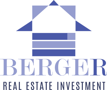
For this project I put up this logo for an imaginary Real Estate Investment Company. The logo is a slightly variation of a logo that I put up on an auction online and won the contest. The variations are the name of the company, and slight modification to the colors of this logo. The logo is creating with the help of negative space a house, the symbol for the activity in real estates. It creates also a arrow pointing up that represents growth, financial succes, the most important parts in real estate invesmtents. For the font I used a Serif modern font to represent trust and grandeur, and for tyhe tagline I used an sans serif for easy reading and to complement the name of the company. The two purple colors represent luxury and upper class and is a principle for marketing of this brand to symbolize power, royalty and trust. The different colors are meant to represent building blocks and construction as the main activity of the brand is Real estate investment.
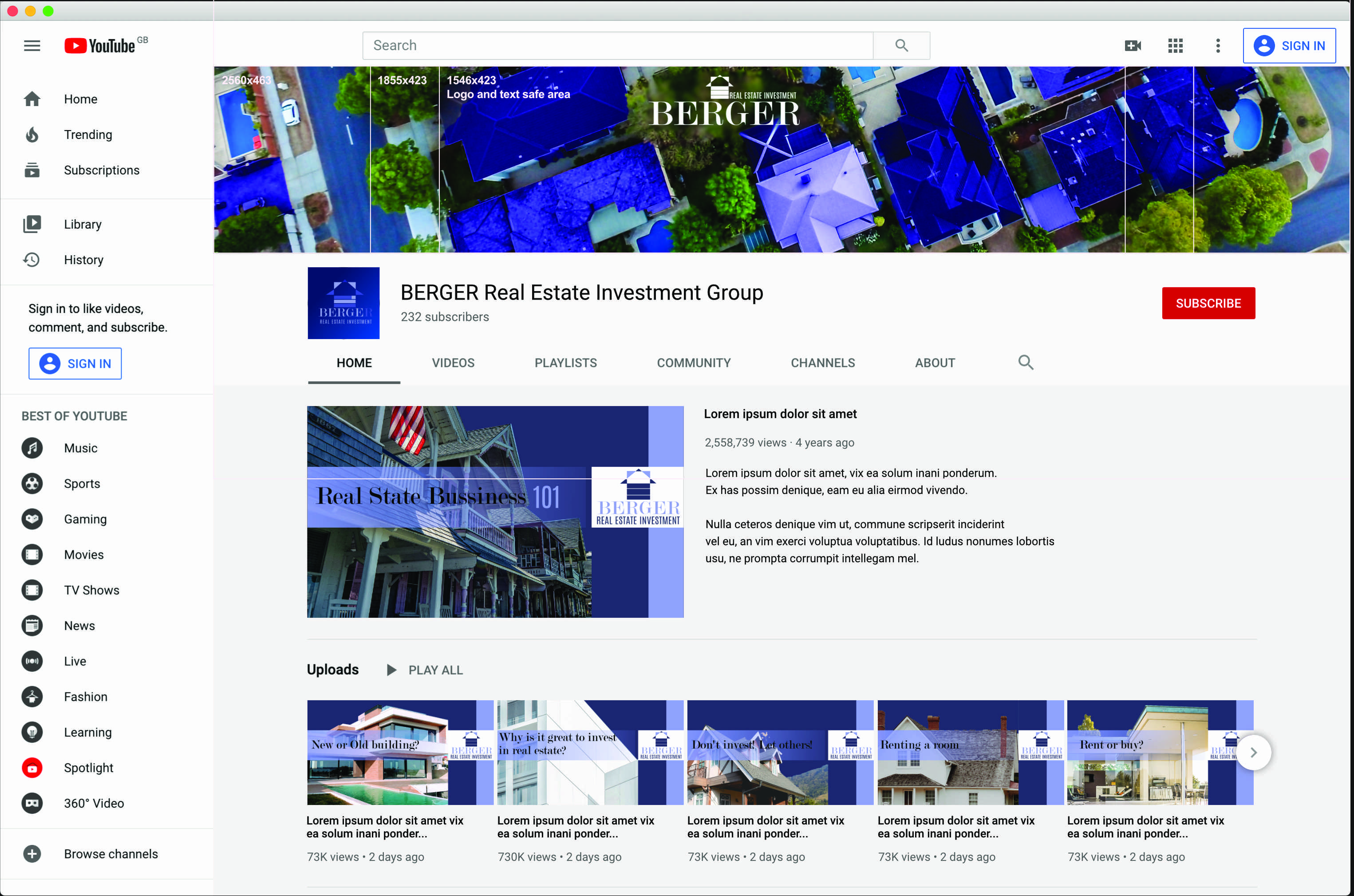
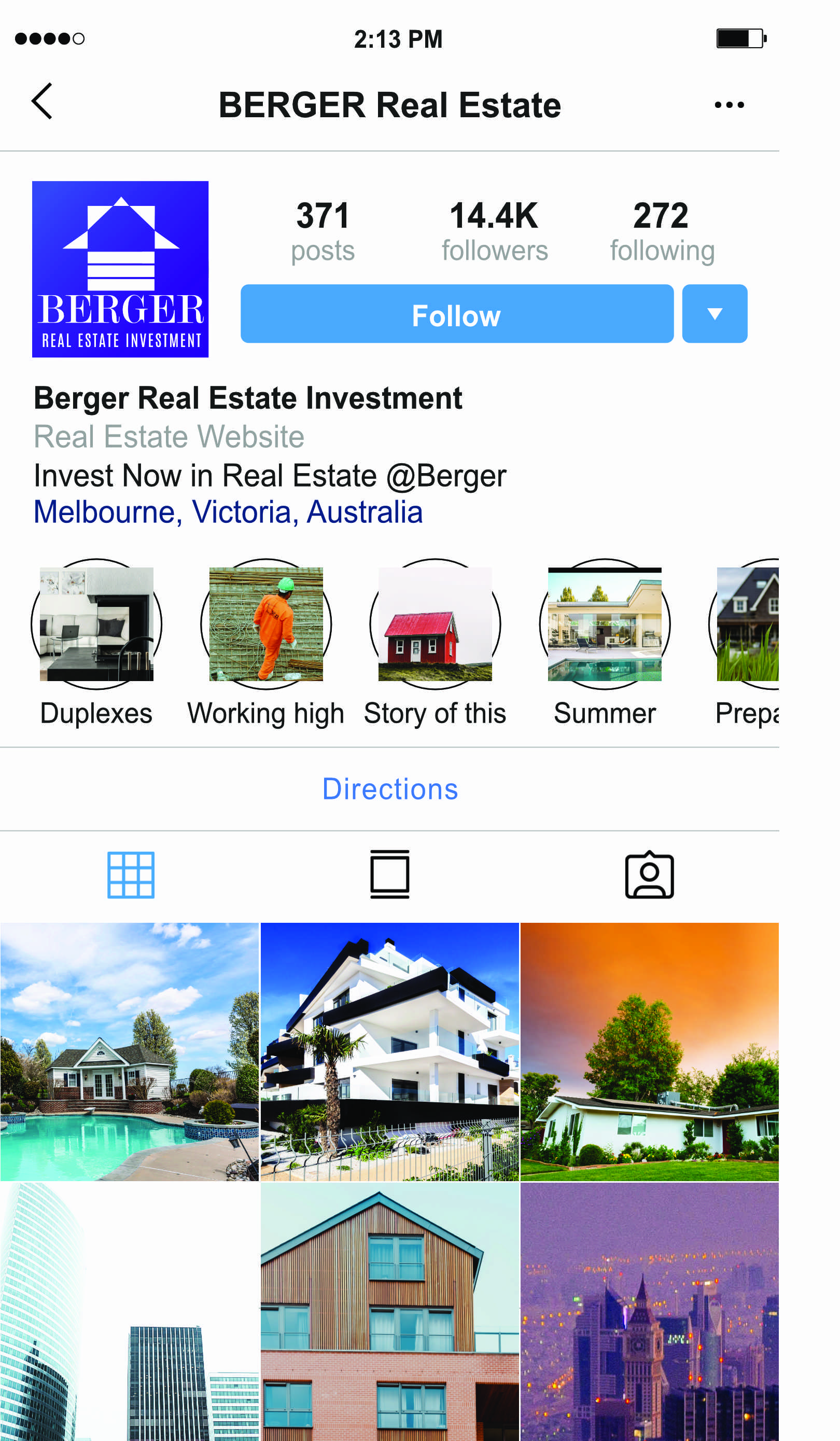
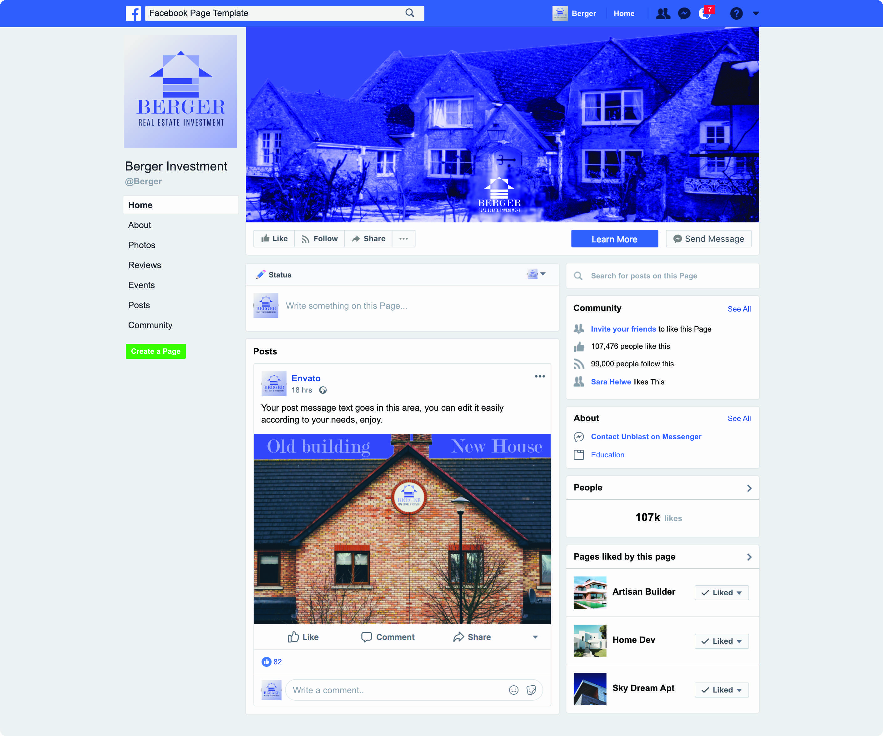
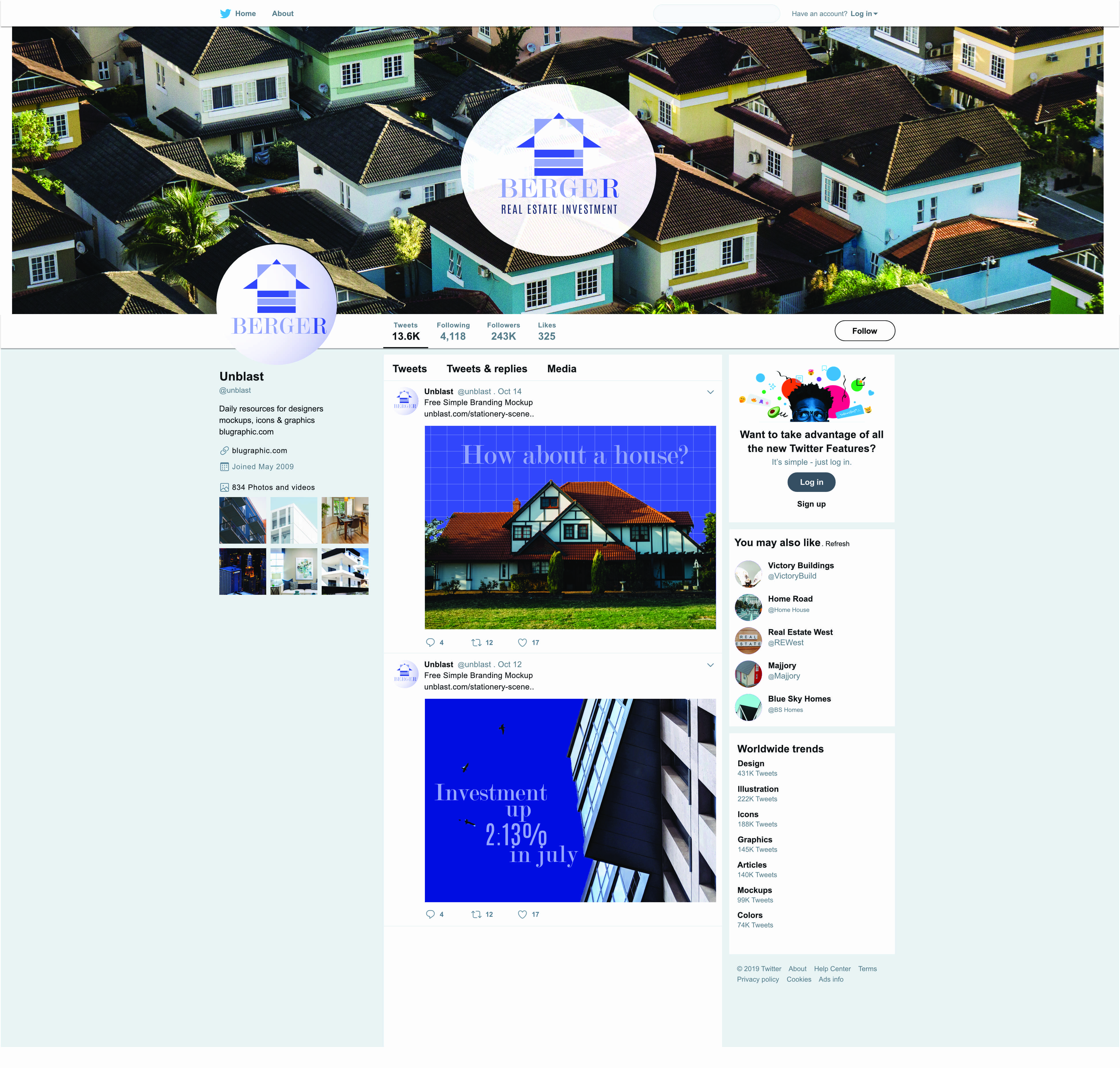
Nowadays, I think, every company and every Institution needs an image on social media as an important channel of communications. The social media image that a brand creates is defining it's overal image and philosophy. So for this part of the portfolio I tested this logo agains different parts of social media, taking into account the character of every environment and the main users for that platform at the time. I consider that every brand should take into account the dynamic way in which online media threats it's users and to take into account to have ceaseless efforts to deliver their messages and resolve feedback and other issues accordingly.